Creative Design Stores: How SunniYuki Builds a Cohesive, Collectible Artist Store
September 10,2026 6:27 PM(UTC+8) 305 views
A focused Artiststore can feel complete without a huge catalog when visual identity, product presentation, and fandom-focused collections work together.
A strong artist store does not need hundreds of products or an elaborate layout to feel complete. SunniYuki's Artiststore shows how a clean visual identity, thoughtful product presentation, and a clear fandom focus can make a relatively compact storefront feel polished and easy to understand.
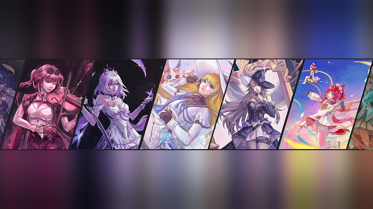
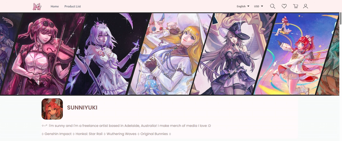
From the banner and collection covers to product thumbnails and character art, the same soft, anime-inspired direction carries through the store. The result is not simply a set of listings, but a storefront where the products feel like they belong together. That cohesion is what makes SunniYuki a useful Creative Design Stores case study.
A Consistent Visual Identity at First Glance
🌸 One of SunniYuki's clearest strengths is consistency.
The banner, product thumbnails, colors, character illustrations, collection covers, and overall layout all reinforce a similar visual mood. Visitors can quickly understand both the artist's style and the kind of products they are likely to find.
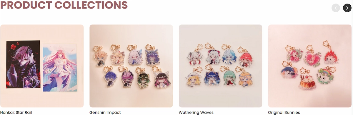
The storefront also groups recognizable creative themes into collections, including Honkai: Star Rail, Genshin Impact, Wuthering Waves, and original work. Even as the characters and fandoms change, the presentation remains connected.
The goal is not to make every product look identical. It is to make separate products feel like they belong to the same store.
Product Thumbnails Designed for Fast Browsing
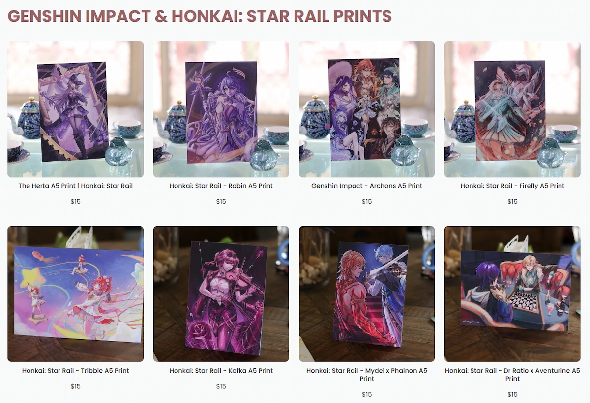
SunniYuki's product images are generally clean, bright, and visually consistent. Character artwork stays at the center instead of competing with busy backgrounds or inconsistent framing.
What Makes the Thumbnails Work
·Simple backgrounds keep attention on the product.
·Similar framing makes different designs easier to compare.
·Characters remain recognizable at smaller sizes.
·The grid feels organized rather than visually crowded.
💡 A useful rule for artists: your product image should still make sense when it becomes a small thumbnail.
This matters on collection pages, mobile screens, and social previews, where visitors often scan several products before deciding what deserves a closer look.
Build Around a Clear Fandom Audience
SunniYuki's store is clearly built for anime and game fandom audiences. Collections centered on Genshin Impact, Wuthering Waves, and Honkai: Star Rail make that focus easy to understand.
The product mix also fits the way many fans like to collect and display artwork, with formats such as acrylic charms, prints, and other smaller character-focused merchandise.
A focused store does not need to appeal to everyone. It needs to make the right visitor feel that they have found something made for their interests.
Use Homepage Order to Guide Attention
The first products visitors see on SunniYuki's homepage are colorful, character-led, and easy to recognize. That gives the opening part of the store a clear job: create enough interest for visitors to keep browsing.
Think Like a Convention Booth
A useful way to think about an artist-store homepage is as a convention booth display. The first row does not need to show everything. It should show enough of your strongest work to communicate the style and invite someone closer.
For most artist stores, the top of the page is a good place to prioritize:
·recognizable characters or signature artwork
·strong, readable product images
·a representative mix of collections
·products that immediately communicate the store's visual direction
Make a Smaller Catalog Feel Like a Real Artist Brand
SunniYuki's store does not rely on an enormous product count to feel established. The structure, artwork, collection names, and consistent presentation make the storefront feel intentional rather than unfinished.
For artists starting out, this is an important distinction. Adding more listings can increase variety, but quantity cannot replace a clear identity.
A smaller store can still feel complete when visitors can quickly understand who the artist is, what the visual style is, and how the products connect.
Design for Social Sharing and Small Screens
📱 The same clarity that helps the storefront also helps when products are shared elsewhere.
SunniYuki's character-led thumbnails remain recognizable when viewed small, which makes them well suited to feeds and previews on platforms such as X, Discord, TikTok, and Instagram.
When preparing product visuals, it helps to check whether the design still works in a small preview. Strong details include:
·one clear focal point
·recognizable character silhouettes or faces
·consistent cropping and framing
·enough contrast for the subject to remain readable
A beautiful full-size illustration can still become a weak product thumbnail if its most important details disappear when reduced.
Create a Collectible Feeling
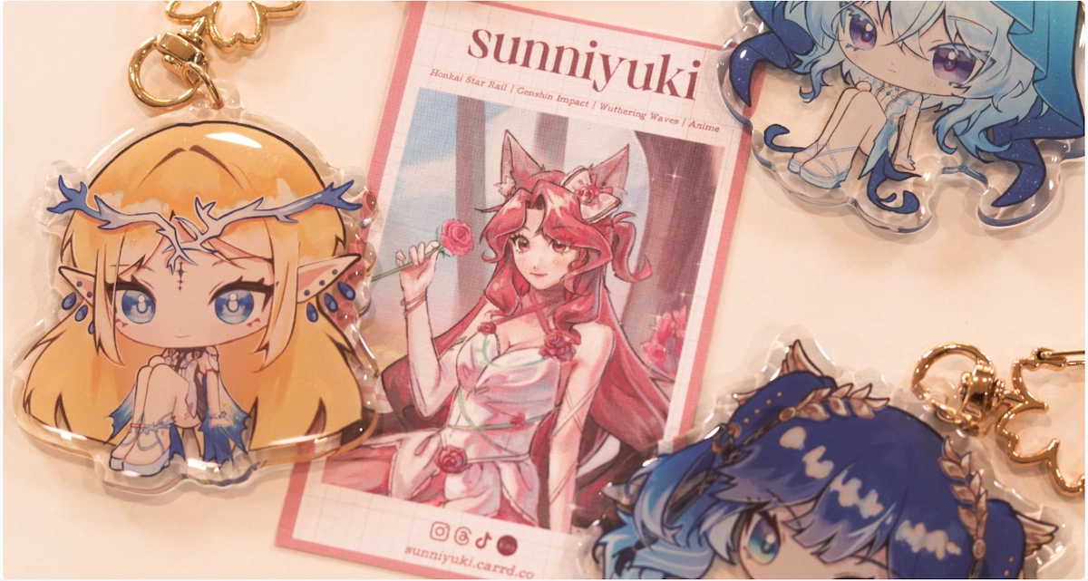
Another strength of SunniYuki's storefront is the way related designs are shown together. Rows of character keychains and coordinated collection pages naturally encourage visitors to see individual products as part of a larger set.
From Single Products to a Series
This is especially effective for fandom merch, where fans may already want multiple favorite characters from the same game or series. A consistent group of designs can create a stronger sense of collection than isolated listings.
Artists can support that feeling by keeping related products easy to discover, presenting them with consistent imagery, and grouping them into clear collections.
The product can still be functional, but the stronger emotional thought is often: "I want to collect this."
What Other Artists Can Learn From SunniYuki
SunniYuki's store offers a practical reminder that good storefront design is often less about adding more and more about making the existing pieces work together.
·Define a visual direction. Keep colors, artwork, and presentation connected enough to feel intentional.
·Treat thumbnails as part of the store design. Clean, consistent images make browsing easier.
·Organize around what fans recognize. Clear fandom and collection groupings help visitors find relevant products.
·Put strong work near the top. The first screen should quickly communicate what the store is about.
·Check small-screen readability. Product visuals should remain recognizable in grids, mobile layouts, and social previews.
·Build collections, not only listings. Related designs can strengthen the sense of a larger creative world.
·Do not chase catalog size. A focused, well-presented store can feel more complete than a large but disconnected one.
Final Thoughts
✨ SunniYuki shows that an attractive artist store does not require excessive decoration or an enormous catalog.
The strongest elements are much simpler: a recognizable visual identity, clean product presentation, thoughtful homepage order, fandom-focused collections, and products that feel connected rather than random.
For other artists building an Artiststore , the most useful goal is not to make the page look complicated. It is to make it easy for visitors to understand who you are, what you create, and why the products belong together.
A clean, focused storefront can make a strong first impression long before the catalog becomes large.
FAQ
What makes an artist store look cohesive?
A consistent visual language helps most. Use connected colors, artwork, product imagery, and collection presentation so separate listings still feel like part of one store.
Do I need a large catalog before launching an artist store?
No. A smaller catalog can still feel complete when the products are well presented, clearly organized, and visually connected.
What makes a good product thumbnail?
Keep the subject clear, avoid unnecessary clutter, use consistent framing, and make sure the design remains recognizable at a small size.
How should artists choose which products appear first on the homepage?
Lead with visually strong, recognizable products that represent the store well and give new visitors a quick sense of the artist's style.
How can fandom merch feel more collectible?
Group related characters or designs into clear collections and present them consistently so fans can easily discover the wider series.
Ready to build a store around your own creative world?
With Artiststore, you can turn your artwork into print-on-demand products, organize related designs into collections, and build a storefront that feels recognizably yours.