Matte vs Glossy Prints: Which Is Better for Your Art?
October 20,2026 9:29 PM(UTC+8) 79 views
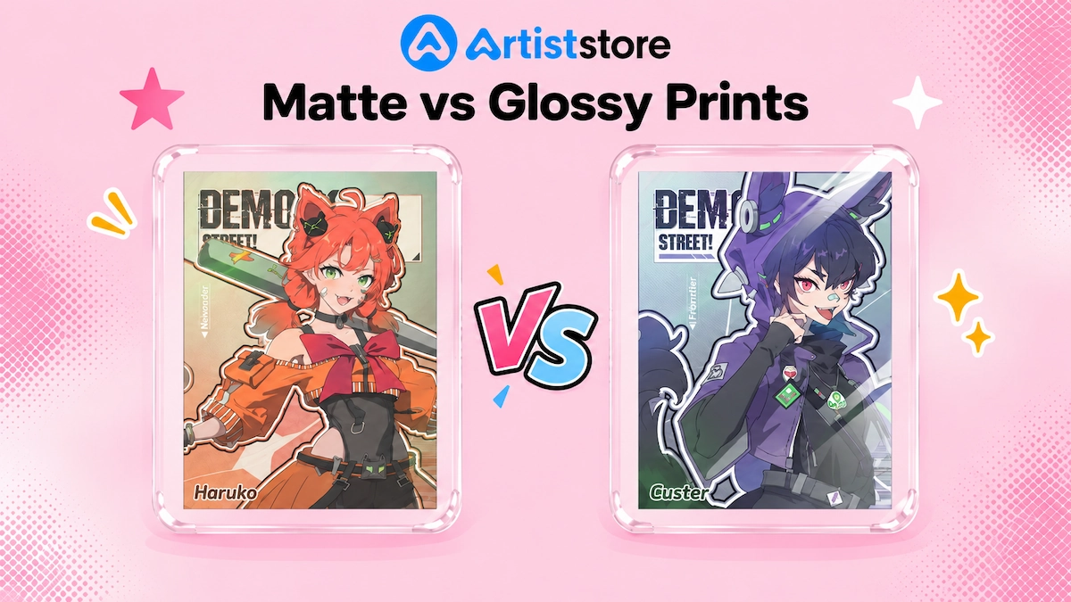
You’ve spent hours getting the colors and shading right. Now you want to turn your drawing into a print, and there’s one more choice: matte or glossy paper.
Both can look good, but they won’t give you the same result. A color you love on glossy paper might look softer on matte. The shine can change how easy the picture is to see, too. Here’s what to know before choosing a finish for your art.
Matte vs Glossy at a Glance
| What you're checking | Matte | Glossy |
| Surface | Little shine | Shiny |
| Reflections | Generally less noticeable | More noticeable at certain angles |
| Color | Can appear softer | Often appears more vivid |
| Blacks | May have less depth | Often deeper |
| Fingerprints | Usually less visible | Usually more visible |
| Artwork to try first | Drawings and watercolors | Photos and bold illustrations |
What Is a Matte Print?
As the name suggests, matte paper has little shine. There’s less glare to get in the way of the picture, which can suit pencil sketches and soft watercolors.
Think of a painted bunny with pale pink ears and faint shadows beneath its paws. Matte paper can suit that soft look. The lightest brush marks need to come through clearly so you don’t lose those little details.
The surface can be smooth or have some texture. Matte doesn’t mean rough. Some sheets feel like drawing paper, while others have almost no grain at all.
Black may look softer than it does on glossy paper. That doesn’t mean the whole print will look dull. Matte can still produce rich colors, though the paper, ink, and printing all play a part.
What Is a Glossy Print?
Glossy prints have a smooth surface with a noticeable shine. On this paper, colors can look rich and black can look deep. It can work well for photos or drawings with lots of bright color.
Take the orange fox drawing: yellow fireflies around it, dark blue sky behind it. Gloss could help the orange fur and little yellow lights stand out against the blue.
The shine does come with glare. Hang the print across from a window and you may see the window reflected in it. A lamp can do the same, making part of the picture hard to see from certain spots in the room.
Gloss also shows fingerprints quite easily. A thumb mark on a dark background can be especially obvious, so pick up the print by its edges. Keep it in a protective cover until it’s ready to display, and don’t assume the shiny surface is waterproof.
How to Choose a Finish for Your Artwork
Start with one drawing. You don’t need to choose paper for everything in your shop just yet.
If you’ve painted a pale watercolor bunny, try it on matte paper. Check the pink in its ears and the shadows under its paws. Can you still see them, or are they too light?
For a bright poster, try glossy paper. Look beyond the strongest colors. The red coat might look good, but check that the shading on the face has printed well.
Pick a drawing with the kinds of details you use most. Look for:
● Pale colors and light pencil marks.
● Dark areas beside each other.
● Fine lines, small words, and faces.
● Colors you use in several designs.
There’s no rule that says bold art needs gloss or soft art needs matte. Put the samples side by side and see which one looks closer to your drawing.
Lighting and Framing: Try the Print Upright
Put the print upright near a lamp. Take a few steps back and see if any reflections cover the picture. A print can look fine flat on a desk but catch the light once it’s on a wall.
Move it near a window, away from direct sun. Look from both sides of the room. Later, turn on the room lights and look again. You might notice glare that wasn’t there during the day. Try sitting down, too, so you can see how it looks from a chair or sofa.
If you’re selling framed prints, put the sample in its frame. Even matte paper can be hard to see behind reflective glass. Glossy paper has its own shine, so the frame may add more reflections.
A framer can help you choose the glass and keep a gap between it and the paper. Switching to matte won’t remove a reflection coming from the glass itself.
At an artist alley, clear plastic covers can reflect the lights above your table. Put one print out without a cover for people to see, and keep the copies for sale protected.
How to Test Matte and Glossy Before a Larger Order
Order one matte and one glossy copy of the same drawing. Use the same printer if you can, and choose the size you plan to sell. Small lines may be clear on a large print but hard to see on a smaller one.
Ask if the printer changes the brightness or colors for you. You’ll want to know about any changes when you compare the samples. The printer should also use the right settings for each paper.
When they arrive, take a close look at both. You might like one straight away, then find that the other shows the pale shading better.
Compare both prints with your original file. Look at them flat on a table, then upright in a frame or clear cover. If details seem lost in a dark area, ask someone else what they can make out before saying what you think.
If both copies have the same problem, ask the printer about it before editing your drawing. For home printing, check that you’ve selected the right paper type. Use the recommended color profile if one is available. If you’re ordering online, follow the printer’s file instructions.
It’s normal for a print to look different from your screen. Screens give off light, while prints rely on the room’s lighting.
Write the paper names on the back of your samples so you know what to order again.
● Money-saving tip: When testing several designs, put a small section from each drawing on one page at its intended print size. Order one matte and one glossy copy. This lets you compare several designs while paying for just two test prints.
Costs, Care, and How Long Prints Last
The finish is only one part of the price. Paper type, thickness, print size, and the number of copies all affect what you’ll pay. When comparing matte and glossy options, use the same size and quantity. A thick cotton sheet and a thin glossy paper aren’t a fair comparison.
Packaging should keep prints from bending or rubbing against each other during shipping. Handle both finishes by the edges, since glossy paper can show fingerprints and matte paper can scuff.
If you sign your work, try your pen or pencil on a spare piece of the same paper first. A pen that works on matte may not write well on gloss. Give the signature time to dry before putting the print in its cover.
The finish alone won’t tell you how long a print will last. The paper and ink matter, along with where it’s displayed or stored. Direct sun can fade colors, and damp conditions can damage the paper.
Check with your supplier before calling a print “archival.” A matte finish alone doesn’t mean it will last for years without fading. Glossy paper isn’t always waterproof, either.
Where to Sell Your Finished Prints

Artiststore platform for selling art, featuring online store and marketplace options alongside mobile storefront previews.
You could book a table at a local art market or sell at an artist alley. Buyers get to see your work in person, and you can talk to them about it. But a stall also means bringing enough prints, setting everything up, and being there for the day.
If you’d rather sell online, Artiststore gives you a way to open a shop without storing prints at home. It offers online store setup and print-on-demand for artists, with production and shipping handled for you when someone buys.
That means you don’t have to buy a large batch of each drawing before you know what will sell. You also won’t need to pack orders or make trips to send them.
Add your shop link to your social media bio and share it when you post a print for sale. Buyers can follow the link to find the price, size, and paper choices. Show photos of the actual print as well, so they can see what they’re buying.
Final Thoughts
You don't need to decide that you're a “matte artist” or a “glossy artist.”
Try both finishes, check the details, and pick the print you’d feel happy sending to a buyer. Save a sample with the paper name written on the back so you know what to order next time.
And if the next piece looks better on a different paper, use it. There's room for both in your shop.